Think about your online course shell like a website for your class. When you go to a website, what are you looking for in terms of navigation or design? Think about the last website you visited.
- Did it take you long time to hunt for what you needed?
- Did you scroll a lot?
- Was it busy or brightly colored or easy on your eyes?
- Did the text feel like it was yelling at you?
If you answered “yes” to some of these questions, chances are you were looking at a bad website.
These are all considerations when building a great website. We can use a lot of these when planning out the navigation of our courses because these are also things we want to avoid in our course menus.
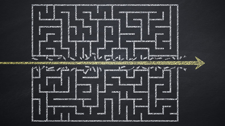
Why does course navigation matter?
Consistency in course menus minimizes the time students need to adjust from class to class. Many colleges will provide menu templates to instructors so the organization structure can easily become familiar to students.
In addition, there should be a level of consistency within the course shell itself. Each unit or each week should develop a system of distributing lesson materials and activities that are uniform throughout the semester so students can depend on the presentation.
This article is part of a biweekly series provided by the Instructional Technology Council, an affiliated council of the American Association of Community Colleges.
Concise navigation is easy to follow and will help students get to what they need quickly so they can spend more time on your lessons and activities. Think about the last time you had to click in 10 different spots to find the item you were looking for on a website. Chances are, you didn’t get that far and may have even given up. Effective web designers present content so users will find what they need within two or three clicks. The same thing should be done in online courses.
Curation helps minimize the chances of excessive navigation. When building a menu, we shouldn’t think about making a list but rather categories for the information we need to program and share in our courses. What items connect or serve similar purposes? For example, do you need three different tabs to share APA formatting, library and academic writing support? Or could you combine all those items on a tab titled “Writing and Research Support?”
This also applies to lesson planning. By programming all the items, a student needs to access for a particular week or lesson/unit in one place, they will spend less time hunting and more time working. It also ensures they see all the pieces in one place which makes it easier to put the puzzle together and plan out their week. Keeping your menu consistent, concise and well-curated will make a short menu bigger on the inside.
Five menu design tips
Start with a menu template.
Many colleges will automatically load a college-approved menu template into a new shell, others may give you the option to start from scratch or allow you to request a template to be added. Department-designed templates will provide all the commonly used tools and content area for adding course lesson materials. It will easily jumpstart your course design process.
Academics love creativity and developing lesson materials but in terms of navigation, you should look for a balance between creativity and consistency. If you know students are familiar with a style of menu design, that takes some pressure off of you. They will already be familiar with how to follow your course. There are still a variety of ways to personalize and customize a course menu template like adding an FAQ tab or additional academic support resources specific to your course.
Think about what your students will need the most.
Consider listing some of the main items your students will need, and then identify how they can be categorized. Most of this will be taken care of when working with a template, but maybe you want to add some new menu items. Think about how often students will use these resources to help prioritize the items in your menu.
General back-up information can go lower on the menu, meanwhile anything students need to access weekly should be near the “Course Content” or “Learning Modules” tabs. This also works for organizing content areas—Put the items they will click the most at the top, so they do less hunting and scrolling.
Keep menu titles short, descriptive and clean.
When curating resources, we may want to be very descriptive as we create menu titles but think about website navigation menus — those words along the top or side of a site that describe the main parts of a website. Amazon’s top menu consists of only one- or two-word descriptions that summarize content.
Longer titles will take up more space on the menu and could even lead to excessive scrolling, which we try to avoid. Also avoid using all caps in your text; in the online world, this is the equivalent of yelling at someone. Lastly, avoid bright colors or attention-grabbing tones because these color schemes tend to hurt your eyes or effect ADA compliance. Here’s more information on ADA compliance and color contrast, click here.
Keep your menu short.
While we understand you may have a lot of content to share with students, consider using or designing a menu that allows all menu items to be displayed on the course site with minimal or no scrolling. This will ensure students see all the menu options the first time they land in the course.
Most of the time when we miss a menu item, it’s because we didn’t scroll down far enough. Prevent that from happening right from the first day of class with a robust, but short, concise menu. Remember that menus are fixed or pinned to the side of the browser so if students have to jump around from section to section, they may need to scroll all the way down for a resource, but then all the way back to complete an activity. Design with proximity in mind.
Include a navigation video.
Even if you are using an established and commonly distributed menu on your campus, it is still a good idea to create a short navigation video for your course. This is a good practice for all modalities because it creates an “on-demand” video tour of your course that students can access at any time. Even if you are consistent with other course sites, this may still be your student’s first course or maybe this just confirms your design will be like other courses. It provides a little extra support for your students and is a great opportunity for a little teacher personality and presence.